Kunsthaus extension by Chipperfield
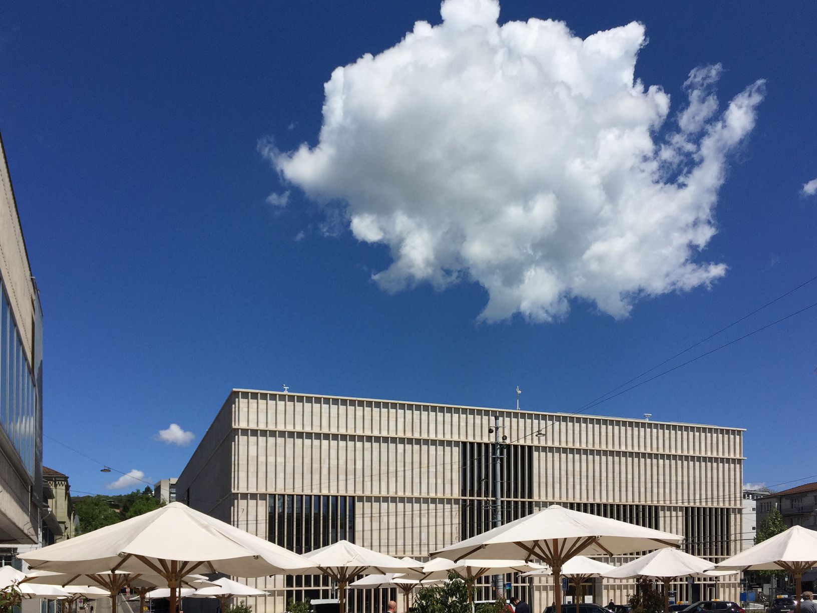
Zurich is finally getting a striking extension for the arts, making the Kunsthaus the largest art museum in Switzerland.
David Chipperfield’s new museum building not only creates an interesting urban order on the centrally located Heimplatz, the structure also continues the architectural history of Karl Moser’s Kunsthaus from 1910. After the first additions (by Moser), the Pfister brothers very succinctly extended the building in 1958 with an elongated, elevated structure for temporary exhibitions. The cubic extension from Chipperfield, which emerged from an international competition, convinces with a clear setting of a large-scale volume and provides a worthy counterpart to the main building. With the lateral boundaries of the Pfister-building and the theatre, Heimplatz is now surrounded by cultural buildings and forms the prelude to the nearby “Hochschulmeile” with new buildings planned by Herzog & de Meuron and Christ & Gantenbein, among others.
References
With its natural stone façade of Jura limestone, Chipperfield refers to the original building, but in the detailing, the new building is more oriented towards the concrete façade of the temporary exhibition building from 1958. The entrance, marked by a brass door, faces the square, as do the café and the shop.
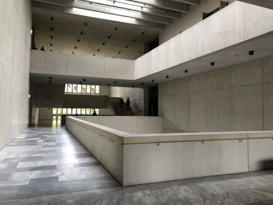
View through the central hall in the first floor towards the door to the ‘garden of art’. Photo by: ©Kristin Müller
A small vestibule leads to the imposing publicly accessible hall, which takes up the entire height and depth of the building and is also impressive for its materialization: grey marble, exposed concrete and brass! The glazed façades of the central hall locate the visitor in the surroundings.
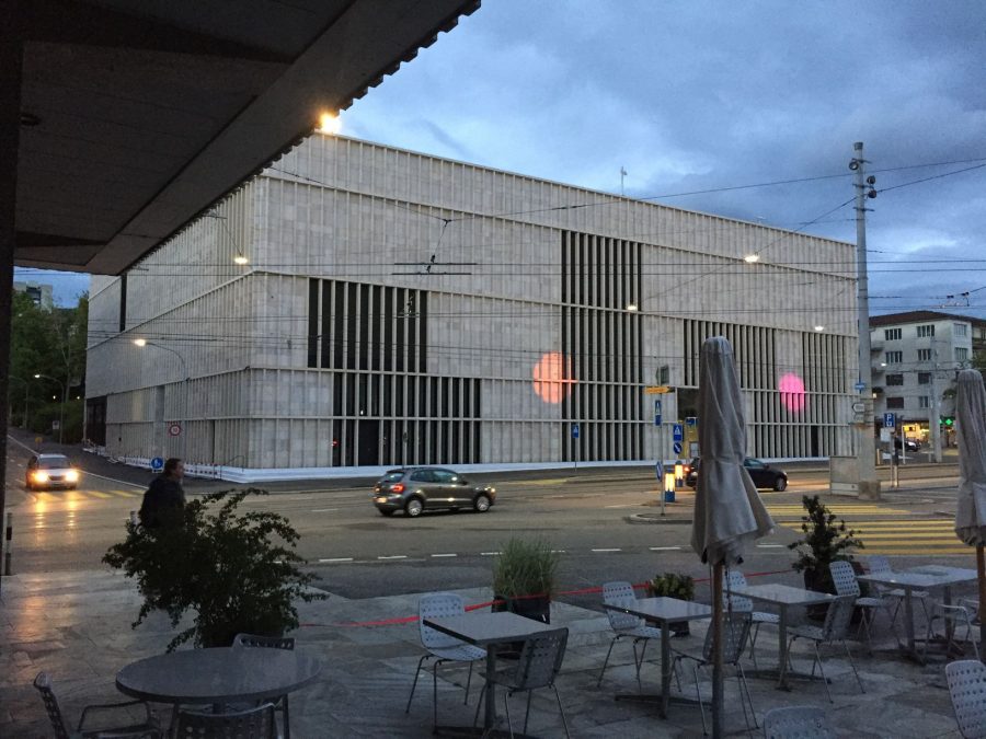
View to the main facade of the Heimplatz during dawn with some light art by Pipilotti Rist. Photo by: ©Barbara Petri
New connections
The hall connects the Heimplatz with the “Garden of Art” at the rear of the building via the generous staircase and allows visitors to pass through the museum without visiting the exhibition.
Other public uses of the entrance level are the event hall, the art education centre and access to the underground connection to the old building.
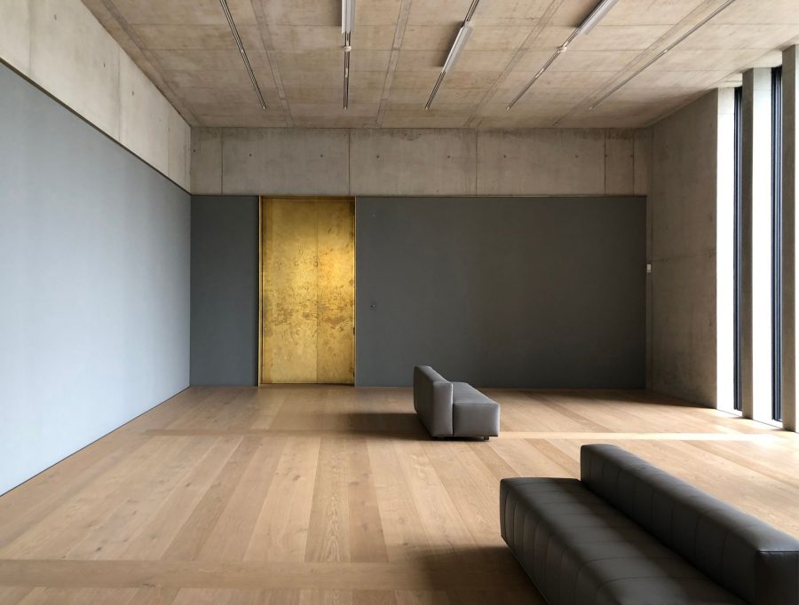
During a first short preview it was possible to visit the inside of the building without pieces of art. Photo by: ©Kristin Müller
On the two upper floors, the exhibition areas are arranged on both sides of the hall in sequences of rooms of different sizes. On the first floor the rooms are lit from the side, on the second by a light ceiling.
In the exhibition rooms, calm materials that support the art predominate, complemented in places by dark wall panelling and brass reveals at the passages.
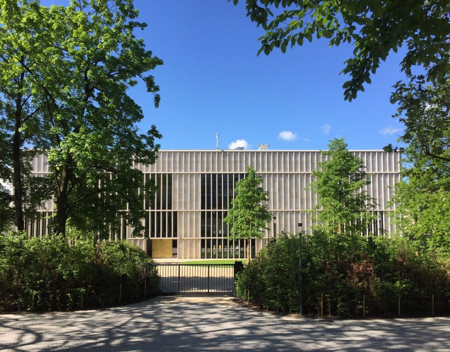
View to the building from the north through the ‘garden of art’. Kunsthaus extension by Chipperfield. Photo by: ©Barbara Petri
Text by: Barbara Petri, ARCHiTOUR


No Comments