New Austrian Post at Rochus, Vienna
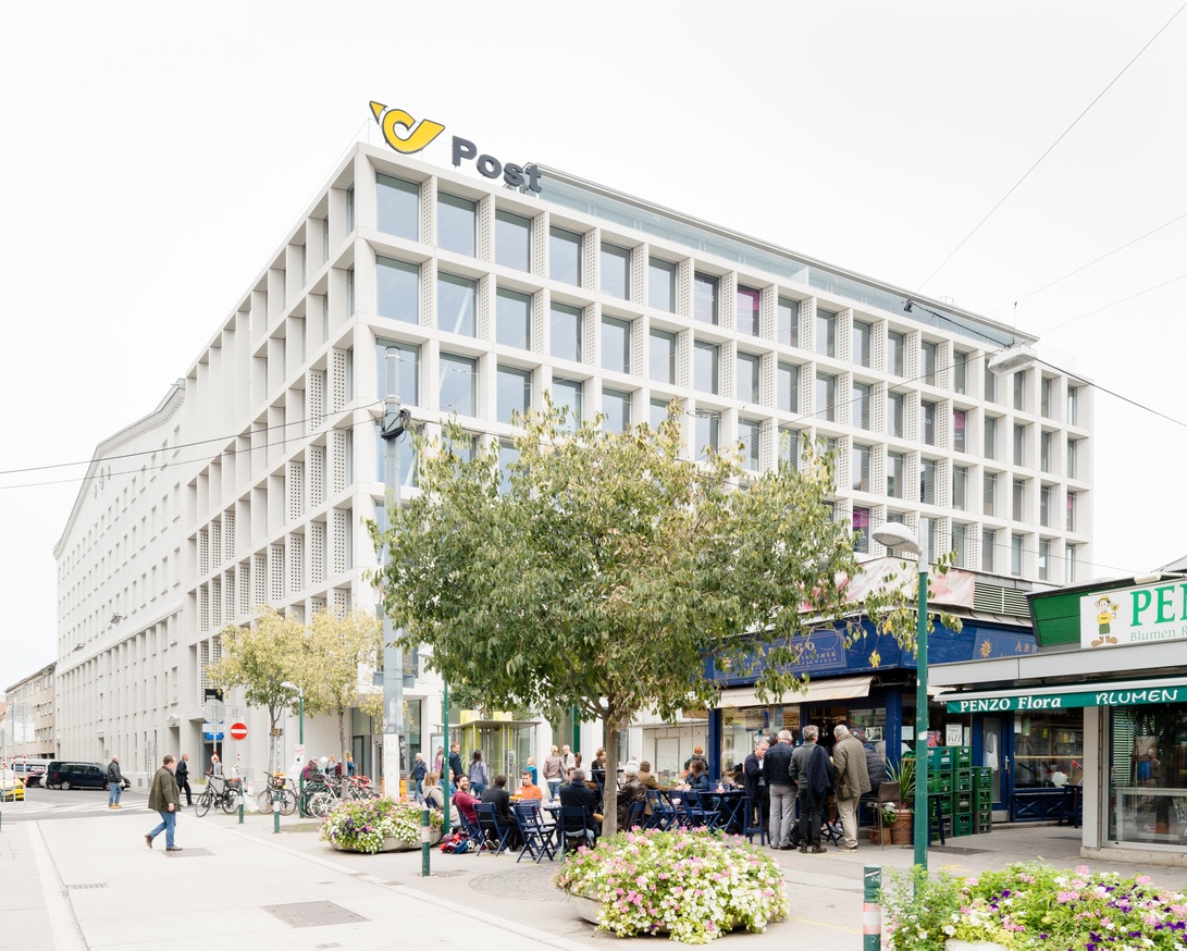
At Vienna’s Rochusmarkt, situated near the center and well visible from highly frequented Landstrasser Hauptstrasse, Schenker Salvi Weber and feld72 have erected a spacious office and commercial building for Austrian Post. Finalized in 2017, this multi award-winning project can now be explored on an architectural tour.
New corporate headquarters of Austrian Post
Ensuing from the site’s polygonal layout, the structure develops into a staggered urban building block. The result is a compact, self-confident ensemble. Rochusmarkt square continues as a shopping mall within the building and connects, as a public passageway, Grete-Jost-Park as revitalized by DnD Landschaftsarchitektur. A daylight-flooded access area facilitates orientation and constitutes an autonomous communication zone.
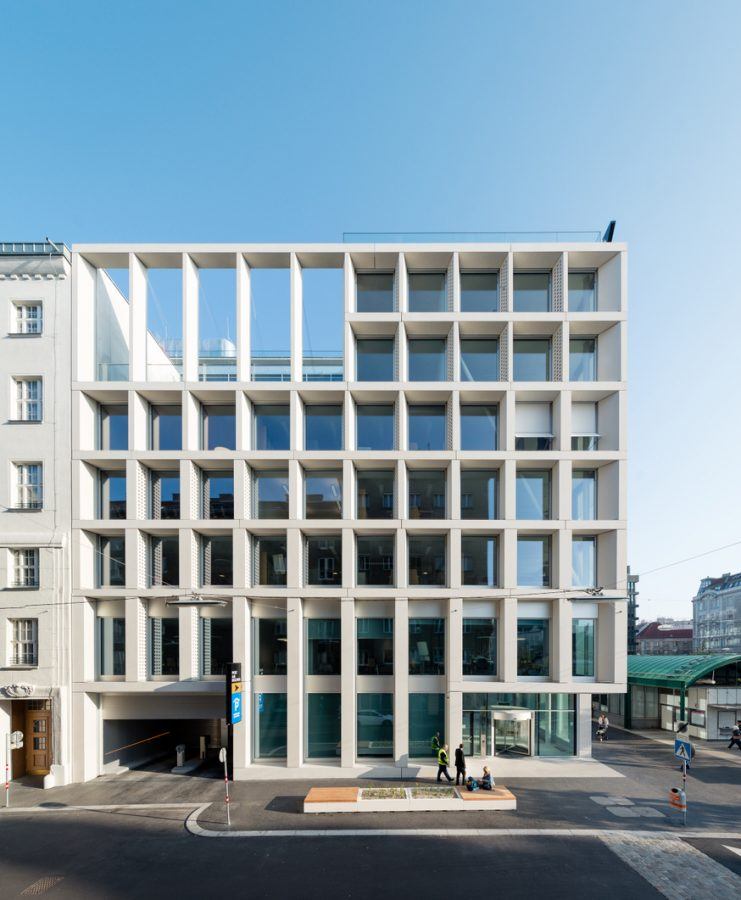
Post am Rochus, Schenker Salvi Weber and feld72 – AUTHOR: ©Lukas Schaller
More than a quotation in Robert Musil’s neighbourhood
The decision to locate the new headquarters of Austrian Post close to the city center required a massive urban densification on the site right next to the underground station. While an existing building at the market square could be demolished, a partially listed building at Rasumofskygasse (near Robert Musil’s Viennese residential address and memorial room) had to be integrated into the new building – another challenge for the architects.
Urban elegance and Viennese lightheartedness
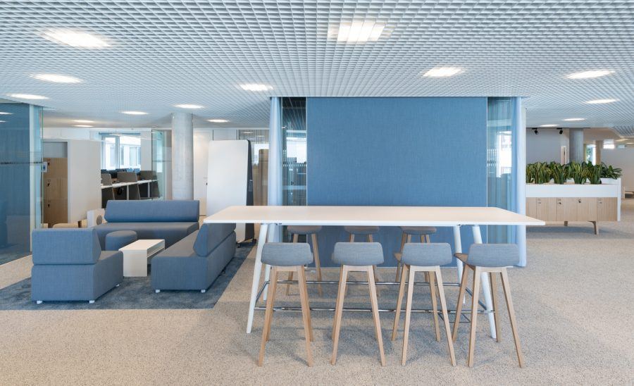
Open Space floor at Post am Rochus, Schenker Salvi Weber and feld72 AUTHOR: ©Lukas Schaller
The structure of the façade, made of precast concrete elements, ensues from the pilaster strips of the existing building as well as their horizontal articulation. The new window areas are all of the same size from the second floor upwards. The open-plan offices, designed for a desk-sharing concept, benefit from the polygonal site; the floors’ arrangement ensures that they can be separated into smaller units. Table groups are situated close to floor-to-ceiling windows, glass boxes with curtains allow for concentrated work. The furnishing pieces dividing the space are moreover acoustically effective thanks to fabric coverings or micro-perforations.
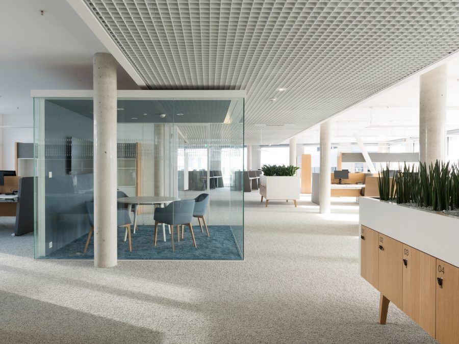
Open Space floor at Post am Rochus, Schenker Salvi Weber and feld72 AUTHOR: ©Lukas Schaller
Post-factual reference to Otto Wagner
The hollow pattern in some of the window reveals originally was, according to Michael Salvi, a romantic reference to the façade of Otto Wagner’s Postal Savings Bank. This pattern was refined and the holes now serve as additional ventilation for the offices: a narrow door to the hollow interior of the perforated supports can be opened by hand. In the evening, they can be illuminated from the balustrades.
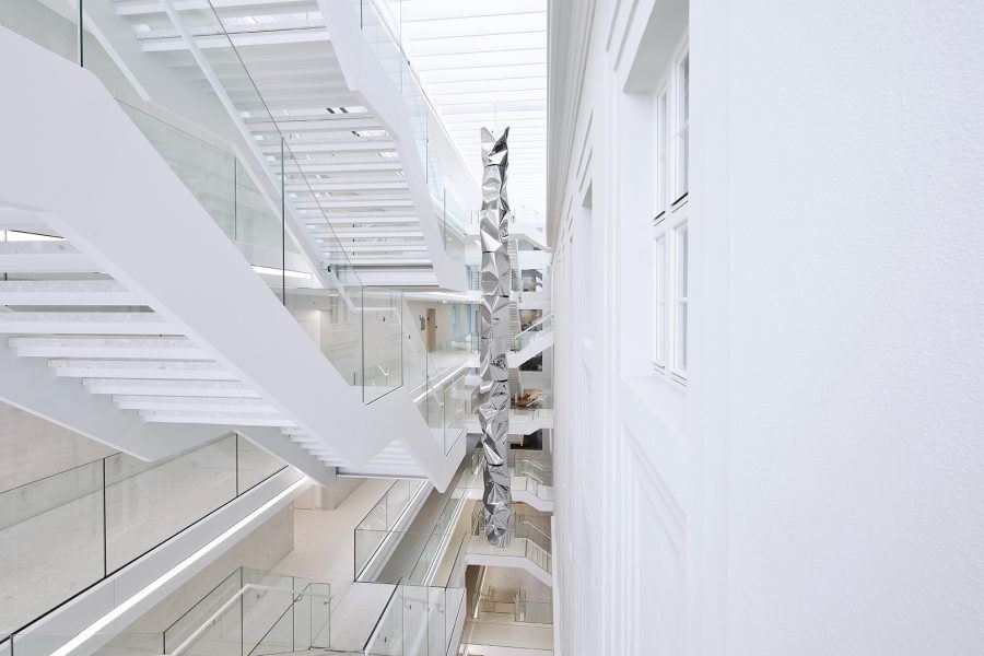
Access floors AUTHOR: ©Lukas Schaller
New life, new light, new cityscape
Seen from the park, the most striking element is the extra-wide and extra-deep light gap between the existing and the new building. Christian Ploderer, responsible for the entire lighting concept, keeps the space free of luminaries. This amazing space as well as the two inner courtyards, designed by DnD Landschaftsarchitektur and artist Peter Kogler, can be visited on an architectural tour.
Text by Gerald A. Rödler


No Comments